December/January Newsletter: Visualizing Bryn Mawr's Digital Competencies

Bryn Mawr College's Digital Competencies Program helps students build the digital skills and critical perspectives on technology needed for success in the digital age.
Happy almost winter break! December is upon us, which can only mean one thing—it’s time to learn about more digital competencies!
This month, let’s dive into 4.3: Critical data visualization! This competency can really be broken down into two tasks—first: working on ways to effectively present data in visual formats, including deciding which format to use based on factors like who the audience is and what topics you’re presenting on. Second, effective data visualization requires learning how to critically interpret and evaluate meaning or arguments through the different visual representations of data (e.g. charts, graphs, maps, timelines, and infographics).
4.3 Critical data visualization in real life
Now that you know what critical data visualization is, how can you use it IRL? Fear not! Here are some LITS tips. There are millions of ways to visualize and present data—but before jumping into a data-oriented project, remember to:
- Stick to the facts—don't manipulate your data too much to fit your narrative!
- Keep your audience in mind (e.g. with accessibility or messages you want to send).
- Think of a specific idea you want your presented data to project and the best ways to critically summarize it in your visualization.
- Be creative!
After all is said and done, don’t be afraid to think outside the box! Sometimes the best ways to present data are not only clear and accessible, but unique. Take these charts for example:
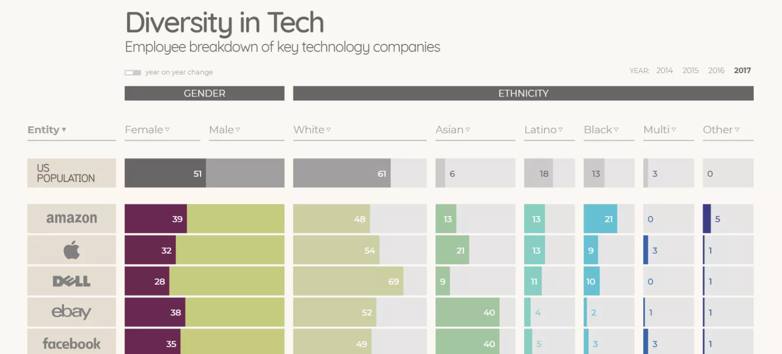
"Diversity in Tech" via informationisbeautiful.net
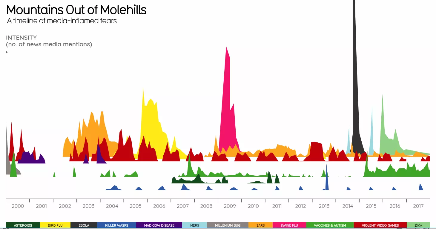
"Mountains Out of Molehills" via informationisbeautiful.net
Even LITS staff members are constantly practicing new ways to present data. Take this recent visualization from our own Nathalia Santos, based on our recent survey of alums of the last ten years. Alums were asked which competencies they use most frequently in their work. We were interested to see that the top five competencies cover all of our competency categories!
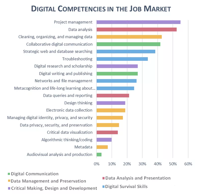
More information and data visualizations from the survey coming soon!
For further information on the best ways to visualize data, just make an appointment with one of our librarians!
November Tech Talk: 3D Modeling
Of course, while creating charts is one of the main ways to visualize data, there are numerous other ones as well. Take, for instance, the work that Jessica Linker and the Digital Scholarship Fellows did with their summer project. In a recent Tech Talk given on November 13, Linker and her Fellows wowed a packed house with innovative ways in which they were able to apply math to virtually recreate Dalton Hall’s historic Advanced Bio Lab. In this Talk, the Digital Fellows not only gave insight into the digital competencies they learned, but outlined the challenges that come from visualizing data and the solutions they found along the way.
For more information about this project, visit the Bryn Mawr Digital Scholarship Program site.
Upcoming News: Pending Release of Alma!
Say hello to Alma! In other exciting news, LITS is updating Tripod's interface on December 20. The new system will offer improved user experience, perfect for helping students develop 1.5 Strategic web and database searching. For more information about what changes to expect, please visit the LITS blog.
Upcoming EventsSee the full events calendar.
Questions? Comments? Want to get involved? Email us at digicomp@brynmawr.edu.